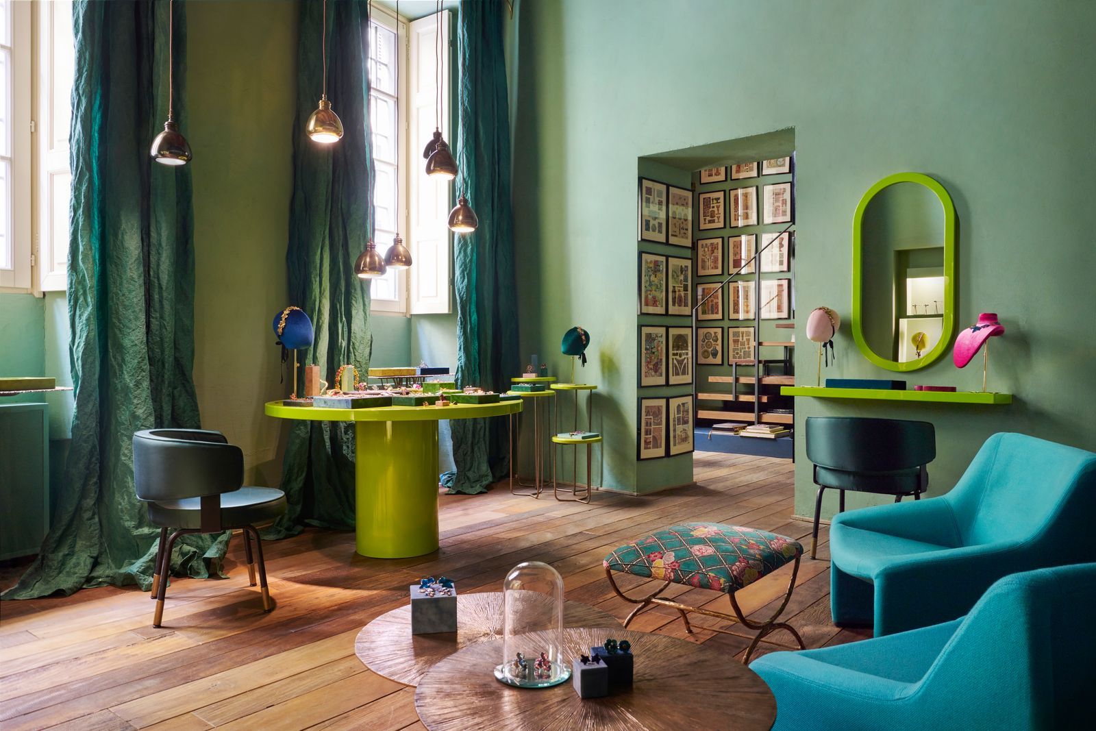
In the age of open-concept living and hybrid spaces, the traditional idea of using walls to define rooms is fading. What’s emerging in its place is more fluid, more expressive, and more emotionally attuned—color zoning. This modern design technique uses shades, gradients, and intentional color palettes to shape not only the visual landscape of a space but also its emotional atmosphere and functional purpose.
Gone are the days when one hue defined an entire room. Now, we see sections of color used strategically to cue behavior, emotion, and activity—a warm coral nook inviting conversation, a deep sage corner fostering calm, or a pop of bright yellow energizing a morning workspace. Designers are embracing this approach to create subtle spatial boundaries without breaking flow or unity.
Color zoning is more than a trend—it’s a strategy of emotional design. By understanding how colors affect mood, energy, and behavior, we can create spaces that support how we want to feel and live. As homes become increasingly multifunctional and emotionally driven, color becomes one of the most accessible and powerful tools to foster intention, identity, and well-being within our wall
Why Color Zoning Matters in 2025
In a world of blurred boundaries—between work and rest, indoors and outdoors, solitude and community—color zoning offers a subtle, creative solution to define purpose and experience within a space.
Key drivers behind this shift:
- Rise of open-plan homes and studios
- Growing interest in color psychology
- Increased need for multipurpose areas
- Desire for aesthetic cohesion without physical division
The Psychology of Color Meets Spatial Design
Every color has an emotional impact. When strategically applied, colors can:
- Boost productivity (yellows, blues)
- Encourage rest (lavenders, soft greens)
- Spark creativity (mustards, corals)
- Create calm (neutrals, desaturated tones)
| Color | Emotional Effect | Ideal Zoning Area |
|---|---|---|
| Soft Blue | Enhances focus, reduces anxiety | Home office, study nook |
| Warm Terracotta | Creates warmth and grounded energy | Dining area, entryway |
| Pale Sage | Promotes calm and mindfulness | Bedrooms, meditation space |
| Vibrant Coral | Stimulates conversation and creativity | Living room, lounge corner |
| Charcoal Grey | Provides depth and quiet | Reading zone, library |
Real-World Applications: When Color Becomes the Architect
1. H&M Home Flagship, Stockholm
Zones are defined not with walls, but with tonal shifts—from soft beige in relaxation areas to bold ochre in creative showcases. Furniture follows suit.
2. Soho Works London
Each workspace uses different color palettes to define the energy of the room. Cool blue areas for focused work. Deep green nooks for phone calls. Warm red lounges for brainstorming.
3. Residential Loft in Copenhagen (by Note Design Studio)
A compact apartment uses a gradient paint effect to transition from energizing yellows in the kitchen to soft greens in the sleeping space, creating a seamless flow without partitions.
4. Kindbody Clinics, US
Healthcare spaces using color zoning to ease patient anxiety—peach and rose tones in waiting areas, soft blues in consultation rooms.
Techniques for Effective Color Zoning
1. Paint as a Tool of Direction
Use accent colors behind desks, beds, or shelves to visually anchor a space. Let the rest of the room fade into neutrals for contrast.
2. Tone-on-Tone Layering
Choose one color family (like sage) and build with variations—dusty sage, pale mint, rich olive—to define zones while maintaining unity.
3. Ceiling and Floor Color Pops
Painted ceilings or color-blocked rugs can define a space without touching walls. Perfect for rental homes or minimalist layouts.
4. Furniture and Decor as Extensions of the Zone
Reinforce zones with color-matching textiles, lighting, and accessories to make the intention more immersive.
5. Digital and Virtual Spaces
Even in virtual interior design tools (like AR apps and metaverse design platforms), color zoning is helping define how users interact with virtual environments.
The Flow Factor: Using Color to Guide Movement
In larger spaces, color can guide flow just like signage. For example:
- Bright tones can pull people into social zones.
- Cool, muted tones signal quiet, personal areas.
- Gradient transitions can softly guide someone from one mood or function to another.
In hospitality, this is already happening. Restaurants use color zoning to differentiate between dine-in, grab-and-go, and lounge sections. Offices use it to guide people through reception, workstations, and rest pods.
The New Open Plan: Micro-Zones Without Clutter
As homes become more multifunctional, color zoning helps organize the chaos:
- A living room can include a navy reading alcove, a mustard chat corner, and a calm oatmeal media area.
- A studio apartment might have a clay-colored workspace, a sage bed zone, and a cream-toned dining area—all without walls.
It turns limited square footage into intentional micro-environments that serve specific emotional and practical needs.
Color Zoning in 2025 Paint Trends
| Trending Color | Brand | Suggested Zone |
|---|---|---|
| “Limitless” | Behr | Entryways, multi-use spaces |
| “Sweet Embrace” | Dulux | Bedrooms, nurseries |
| “Cornflower Sky” | Valspar | Work nooks, creative corners |
| “Clay Pot” | Sherwin-Williams | Kitchens, dining zones |
| “Digital Lavender” | Pantone | Rest areas, self-care spaces |
Designing With Emotion First
Color zoning is part of a broader movement toward emotionally intelligent design—an approach that starts with how a space should make you feel, then builds the layout, materials, and palette to support that.
Color is no longer just decorative—it’s directive. It can tell the body when to relax, when to focus, and when to connect.
What Mattias Knutsson Says About Emotional Flow
Mattias Knutsson, a leading voice in consumer behavior and environmental psychology, sees color zoning as a key evolution in intuitive design. According to him:
“As homes replace offices, studios, and retreat centers, we need smarter cues. Color becomes the gentle conductor that orchestrates how we move, feel, and interact within our space.”
He highlights how color-based transitions reduce cognitive fatigue and enhance emotional resilience in both private and public interiors.
Final Thoughts:
Color zoning is a subtle revolution—one that doesn’t rely on new gadgets or expensive materials, but on a thoughtful, human-centered use of color.
In 2025, the most forward-thinking interiors won’t be the ones with the most stuff—but the ones with the most intentional flow. With every shift in shade, we’re learning how to live with more harmony, presence, and emotional awareness. Because sometimes, the simplest way to change how a space feels—is to change its color.