Most trend reports start with a colour and work backwards to the room. We prefer to start with the room. A home is rarely furnished around one shade of the year. It usually follows a style you have chosen over time, whether that is Scandinavian, Japandi or something more collected and personal.
This AW27 interior style forecast therefore works style-first. We look at seven interior styles that last well beyond any single season. Each one has a stable core, the things that make it what it is, and an AW27 layer on top: the materials, forms and colours that public forecasts and paint launches point towards for 2027. We read those signals through a Nordic lens, with NCS notations and colour names from Nordic paint makers such as Beckers, Nordsjö, Jotun, Tikkurila and Alcro, alongside a few international references.
A note on wording. We frame this article as an autumn/winter 2027 forecast, but most of the open sources we draw on speak of “2027” or “2027+”, not a specific season. Where we quote them, we say so. The mapping of those signals onto seven styles is our own.
The big picture: what is moving for 2027
Across styles, a handful of shared signals keep appearing in open forecasts and 2027 colour launches.
- Warm stone and nut-brown bases. Warm mid-tone beiges and browns are taking over from grey and greige. Tikkurila’s colour of the year Heartland S483, Beckers’ Nötcreme and Little Greene’s Marle 355 all sit in this territory.
- Muted, nature-linked greens. Several 2027 picks land on soft, silvery or earthy greens: Nordsjö’s Soulful Sage (Dulux in other markets), Sherwin-Williams Celery SW 6421 and Benjamin Moore Webster Green HC-130.
- Darker wood. Walnut and smoked oak with visible grain are replacing pale oak in many Scandinavian and Japandi forecasts.
- Brushed metal and patina. Brushed finishes, bronze and unlacquered brass come in; polished chrome steps back.
- The plum family rising. Plum, beetroot, aubergine and lavender appear in several sources, from Jotun’s Velvet Plum to Farrow & Ball’s purple-leaning shades.
- Three moods from NCS. The NCS Forecast Council’s Colours Beyond 2027+ groups its combinations into Pale, Dull Pale and Dark, each with a suggested 60/30/10 balance.
- A move inward. Forecasts talk about retreat, repair and rooms that feel protective. Fewer, better pieces; things that can be mended and kept.
What is cooling: cool grey, stark blue-white, polished chrome and the perfectly coordinated showroom look.
1. Scandinavian / Nordic
Core identity. Light, function, natural materials and a calm, uncluttered base. Rooms that work in long, dark winters.
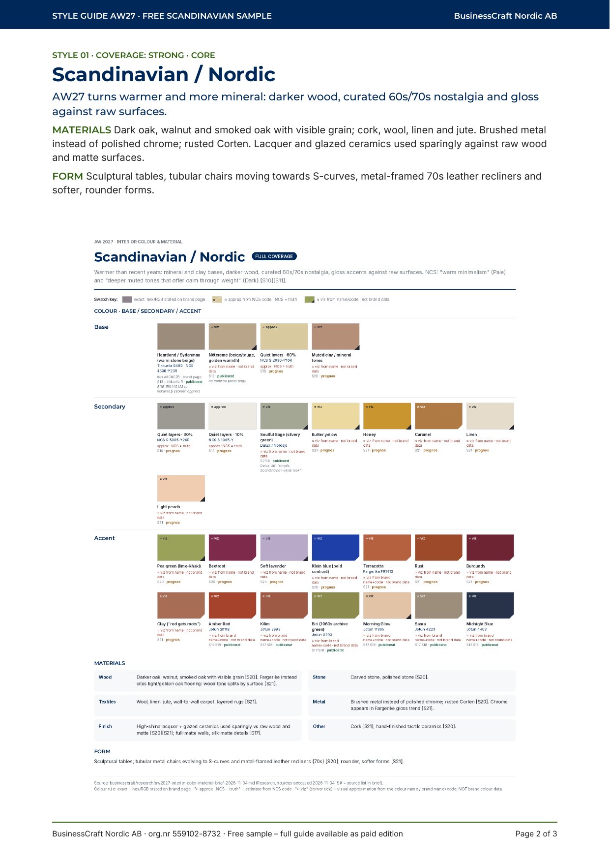
The 2027 update. Warmer and more mineral than in recent years. Nordic forecasts describe darker wood, a curated nostalgia for the 1960s and 70s, and touches of gloss set against raw, matte surfaces. NCS reports that Scandinavian experts in its council pointed to warm minimalism in the pale range and to deeper, muted tones that bring calm through weight in the dark range.
Materials. Dark oak, walnut and smoked oak with the grain left visible; cork; wool, linen and jute; layered rugs. Brushed metal and weathered Corten rather than shiny chrome. Lacquer and glazed ceramics used sparingly, as a counterpoint to raw wood. Forms soften: sculptural tables, tubular chairs that curve into S-shapes, leather armchairs on metal frames.
Colours. For the base, Tikkurila Heartland S483, Beckers Nötcreme and Nordsjö Soulful Sage. NCS Colours Beyond 2027+ offers a “Quiet layers” combination of S 2030-Y10R, S 5005-Y20R and S 1005-Y. For accents, Nordic sources mention clay, pea green, beetroot, soft lavender and a bold Klein blue, as well as butter yellow and terracotta. Jotun’s Journeys chart for 2027 adds 0290 Biri (a green from the 1960s archive), 20118 Amber Red and 4403 Midnight Blue.
What’s cooling. Cool grey walls and bright white with pale oak as the default.
2. Japandi
Core identity. The meeting point of Japanese and Scandinavian restraint: low furniture, natural materials, quiet colour and a lot of space.
The 2027 update. Japandi stays, but it becomes warmer and fuller, with a slight 1970s touch. Rounder shapes, arches and sculptural legs appear, while the base stays low and calm.
Materials. Walnut and dark-stained oak, ideally no more than two wood species in a room. Travertine and dark marble with brown veining. Bouclé and linen, plus woven willow, raffia and jute. Bronze, brass and brushed metal replace matte black. Glass tops add lightness.
Colours. One open 2027 source sets out a simple balance: roughly 60% creamy base, 30% wood and stone, and one muted accent at 10%, either a fresh sage or a deeper aubergine. Dulux Australia’s 2027 “Sensory” palette, inspired by Japanese craftsmanship, moves in the same direction with botanical greens, wheat and cocoa browns.
What’s cooling. Light oak with cool white, and matte black as the only contrast.
3. Soft / warm minimalism
Core identity. Few objects, clear surfaces and a sense of quiet.
The 2027 update. Minimalism has not gone away; it has warmed up. Valspar’s 2027 colour page has a section titled “Soft Minimalism”. Other forecasts use terms such as “atmospheric” and “restorative” minimalism. The common thread is texture: the room is still simple, but the surfaces are softer and more tactile, and imperfection is welcome.
Materials. Lime plaster and mineral paint with visible depth. Light oak or birch with warm undertones. Wool, bouclé and cotton. Textured glass, tactile paper and fragrant woods, with scent itself treated as part of the room.
Colours. Valspar pairs its blue-grey Cottage Door with the warm greige Moon Shot and the soft blush Apricot Blush 8003-8A. The NCS “Quiet warmth” combination from Colours Beyond 2027+ gives a Nordic alternative: S 2020-Y90R as the main colour, S 5020-R as secondary and S 5040-R20B as a small accent.
What’s cooling. Pure cool-white minimalism that feels clinical rather than calm.
4. Mid-Century Modern
Core identity. Clean lines, tapered legs, warm wood and a confident, optimistic palette from the 1950s and 60s.
The 2027 update. The keyword in one 2027 forecast is “retro but not too retro”: sculptural furniture and curves balanced against clean lines. Nordic sources add 60s and 70s nostalgia and tubular metal chairs, which suits this style well.
Materials. Walnut, teak and oak, paired with leather, glass, stone and polished metal.
Colours. The classic palette, with warm neutrals, olive, mustard, burnt orange, teal and deep blue, is evergreen rather than 2027-specific. The 2027 nudge comes from paint launches with a nostalgic streak: Jotun’s reissued 1960s green 0290 Biri and Tikkurila’s mustard-toned L396 Beeswax.
5. Eclectic / curated maximalism
Core identity. Mixed eras, pattern, collected objects and a home that tells a personal story.
The 2027 update. Forecasts describe this as “eclectic-core” or curated maximalism: freer mixing of periods, but with more intention than before. A Swedish source sums it up as collected rather than curated. Sherwin-Williams’ 2027 forecast speaks of chromatic tension and tactile contrast.
Materials. Vintage and inherited furniture, mixed patterns and wallpaper, embroidery and fringing, metal inlays in furniture and floors.
Colours. Deep neutrals form the base: chocolate, mushroom, deep olive and smoky charcoal. Jewel tones in lacquer or velvet work best as one statement piece per room. Jotun’s Discoveries chart offers Velvet Plum, 4223 Sama and 11365 Morning Glow. For a Swedish designer perspective, Alcro’s Signature Collection by Marie Olsson Nylander, launched in October 2026, is worth exploring, though it is not presented as a trend palette.
6. Classic / New Heritage
Core identity. Proportion, craftsmanship and materials that age well.
The 2027 update. Traditional style is being reframed as “New Heritage”: antiques placed in contemporary proportions, a modern cabinet of curiosities, and a renewed interest in nostalgia and handwork.
Materials. Real marble, travertine, unlacquered brass and copper that is allowed to patinate. Velvet, burnished metal and oxidised bronze. Fine woods and art glass.
Colours. Benjamin Moore’s 2027 palette pairs Webster Green HC-130 with Townsend Harbor Brown HC-64 and White Down OC-131. Little Greene’s Marle 355 adds a balanced mid-brown. For the plum family, Farrow & Ball’s Peignoir No. 286, Brassica No. 271 and Pelt No. 254 are cited in 2027 coverage. From the NCS dark range, “Grounded expression” starts from a deep green, S 7020-G30Y, with walnut, terracotta and berry-toned lacquer as suggested materials.
7. Industrial (thin coverage)
An honest caveat first. Open 2027 coverage of Industrial is thin. We found only one source that explicitly labels an industrial direction for 2027, so treat this section as a short note rather than a full forecast.
Core identity. Raw structure on show: concrete, metal, brick and exposed services.
The 2027 note. The one 2027 source describes an “ornamental” take on Industrial: concrete, brushed metals, smoked and ash-toned floors, sculptural curves and deeper tones. That fits the wider shift towards brushed rather than polished metal, and towards Corten and raw finishes seen in Nordic forecasts. The colours mentioned, deep indigo, charcoal, near-black, clay, caramel and coffee, are general rather than specific to the style. We will revisit Industrial when stronger sources appear.
Bringing it home
You do not need to change style to feel current. In most homes, the AW27 layer is about small, deliberate moves: a warmer base colour in place of cool grey, one darker wood, brushed metal instead of chrome, and a single deep accent, whether plum, midnight blue or a muted green. Start with the style you already live with and let the season adjust it. If you are weighing up materials, see our take on plywood as a premium material in 2026–2027.
A look inside Style Guide AW27
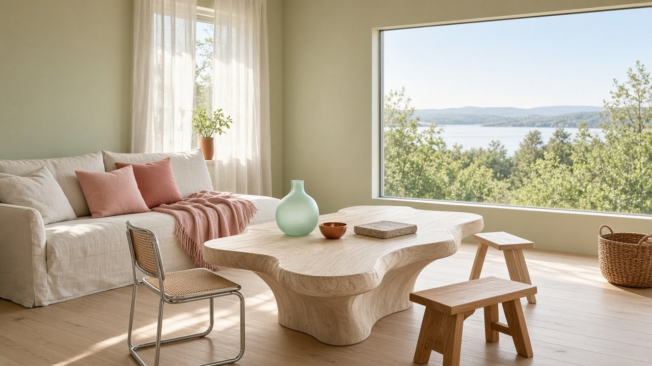
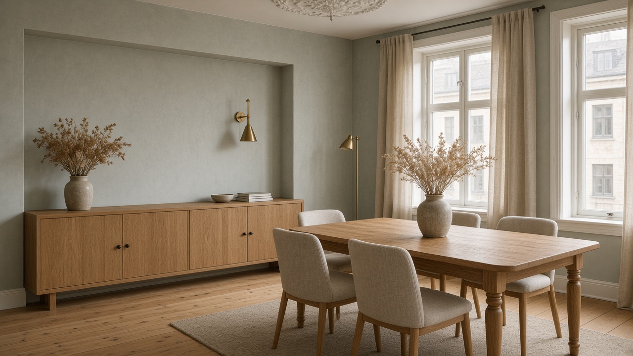
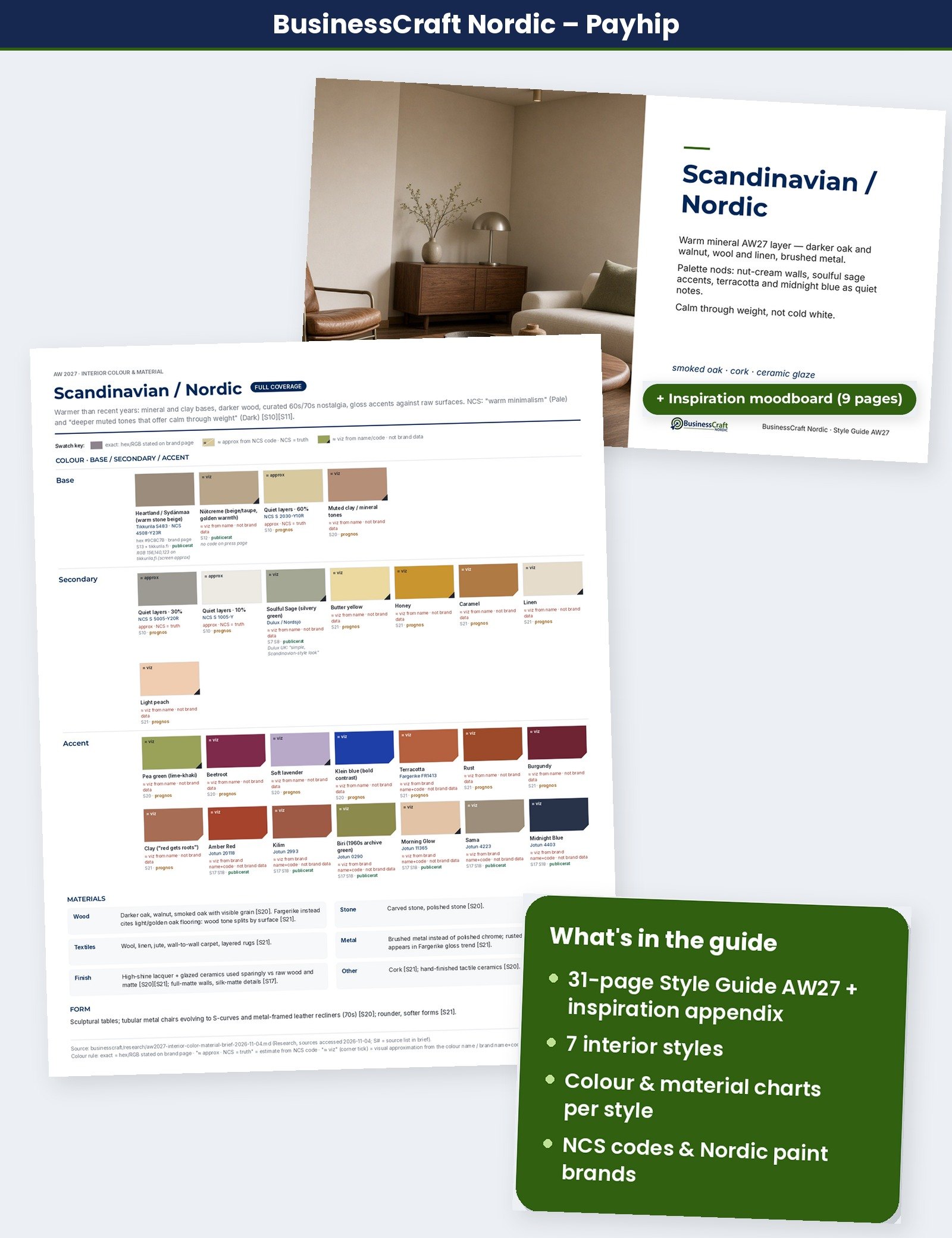
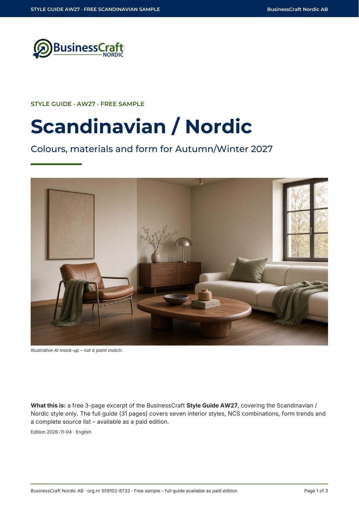
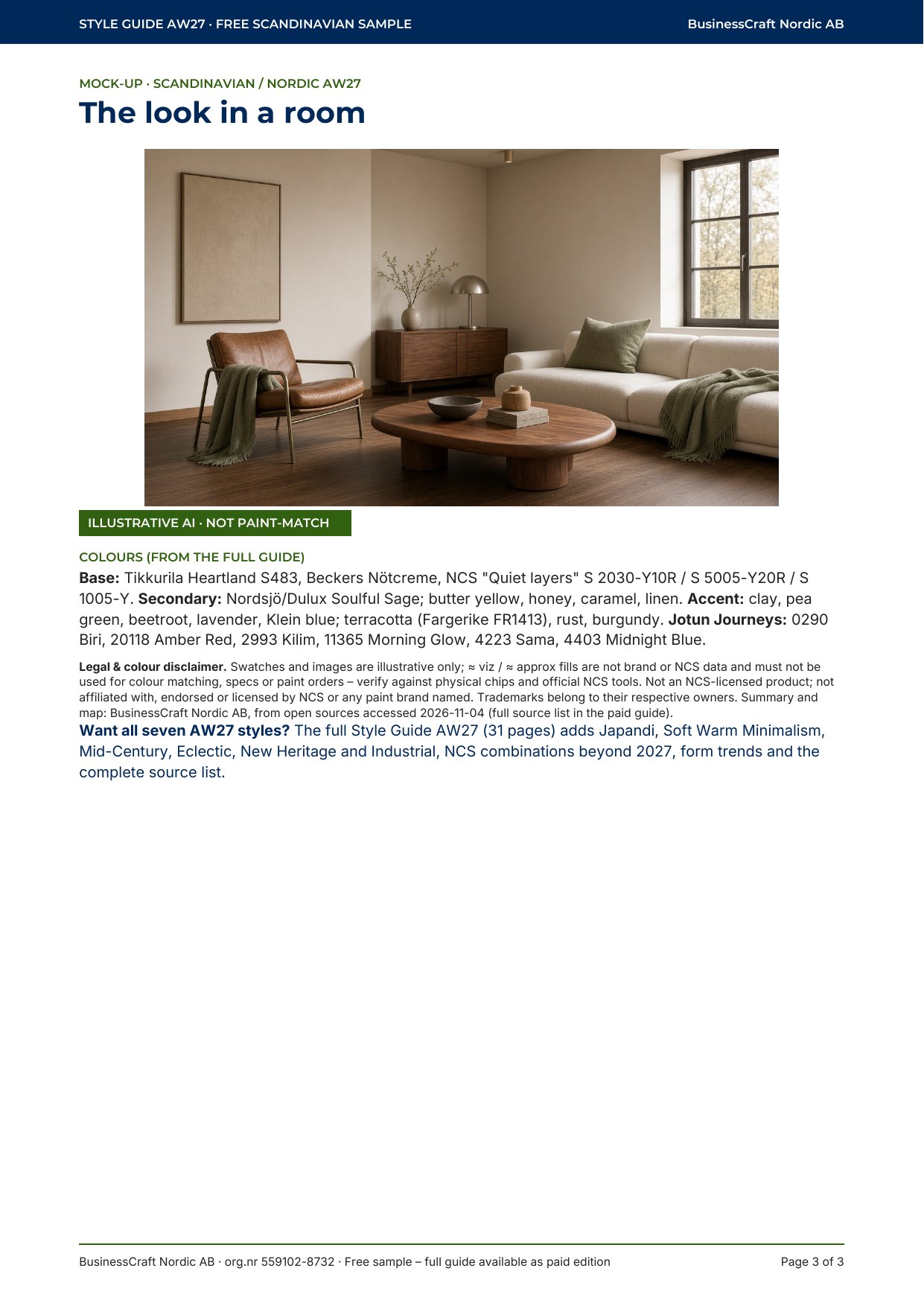
The pages below are from the free three-page Scandinavian sample of Style Guide AW27. The interiors are illustrative AI mock-ups, not photographs of real homes, and are not a paint match. On-screen colour chips are approximate.
Style Guide AW27 is available now — a 31-page guide that maps all seven styles to colours, materials and NCS notations, plus a 9-page inspiration appendix. Get the Style Guide AW27 on Payhip (199 SEK) → or on Gumroad ($19) →. A free 3-page Scandinavian sample is also available: download the free PDF.
Sources and notes
This article is based on open, publicly available sources accessed on 4 November 2026: paint makers’ 2027 colour launches, NCS Colours Beyond 2027+, trade-fair trend pages and editorial trend roundups. Paywalled trend reports are not used for colour detail. Where a source speaks of “2027” or “2027+”, we have attributed it that way; the grouping into seven styles and the AW27 framing are BusinessCraft Nordic’s own interpretation.
Selected open sources (accessed 4 November 2026):
- NCS Colours Beyond 2027+
- Tikkurila Colour of the Year 2027
- Beckers – Årets kulör 2027 Nötcreme (press release)
- Nordsjö – Årets kulör 2027 Soulful Sage (press release)
- Jotun Lady – Journeys colour chart 2027 (press release)
- Alcro – Signature Collection by Marie Olsson Nylander (press release)
- Benjamin Moore Color of the Year 2027
- Valspar Color of the Year 2027
- Sherwin-Williams Colormix Forecast 2027
- Little Greene – Marle
- Farrow & Ball – Brassica
- Dulux Australia Colour Forecast 2027
- Ambiente Trends 27+
- Nordic Nest – Scandinavian interior design trends 2027
- Studiomeen – Japandi 2027
- Essential Home – Mid-century modern trends 2027
- Wallsauce SE – Inredningstrender 2027
- Palio Flooring – Interior trends
Trademarks and colours. NCS® and Natural Colour System® are trademarks of NCS Colour AB. Jotun, Tikkurila, Beckers, Nordsjö, Alcro, Dulux, Farrow & Ball, Little Greene, Sherwin-Williams, Benjamin Moore, Valspar and other brand names are trademarks of their respective owners and are used here only to identify publicly stated colour names and codes. BusinessCraft Nordic AB is not affiliated with, endorsed by or a licensee of these companies. Colours shown on screen are illustrative only and vary between devices; always check against the manufacturer’s physical colour chip and, for NCS, official NCS tools before choosing paint.