A Season of Emotional Colour and Expressive Living
Spring/Summer 2026 is not just another seasonal shift in interior design — it marks a meaningful transformation in how we relate to our homes. After years dominated by beige minimalism, cool greys, and restrained palettes, homeowners across the globe are embracing something far more personal: colour with emotion, depth, and presence. This year’s SS2026 Rich Colour Renaissance is more than a decorative movement.
It is a response to how people want to feel inside their homes. Over the past five years, research from global home improvement platforms has shown a steady increase in consumer searches for bold paint colours, immersive rooms, and expressive interiors. In fact, search data from late 2025 into early 2026 indicates that interest in “colour drenching” has increased by approximately 140–150% year over year. Meanwhile, deep blues and warm earth tones have seen double-digit growth in paint sales compared to soft greys.
The message is clear: homeowners no longer want safe spaces. They want soulful spaces.
Colour in SS2026 is immersive. It is layered. It is intentional. And most importantly, it is human.
In this in-depth design report, we explore the leading palettes of the season — petrol blue, earthy ochres, warm reds, and lemon-vanilla hues — alongside real data, expert-backed insight, and practical guidance to help you energize your home with confidence.
The Cultural Shift Away from Neutrals
For nearly a decade, minimal neutral interiors dominated design. White walls, pale woods, and soft greys offered a clean, universally appealing aesthetic. These spaces photographed beautifully and provided a safe foundation for resale value.
However, cultural shifts often influence interior movements. After extended periods of global uncertainty and remote living, homeowners increasingly crave warmth, comfort, and emotional stimulation within their environments.
Recent housing trend reports indicate:
- 62% of homeowners say they want their home to feel “more personal” than five years ago.
- 58% report that colour influences their mood daily.
- Paint brands have reported a 20–25% increase in darker blue and earth-tone sales compared to light grey shades.
Minimalism is no longer disappearing — it is evolving. Instead of sterile spaces, designers are creating intentional, bold environments that still feel balanced and refined.
The result is what many are calling a “return to richness.”
Colour Drenching: The Defining Technique of SS2026
Perhaps the most defining technique of the Rich Colour Renaissance is colour drenching.
Colour drenching involves saturating an entire room — walls, ceilings, trim, sometimes even cabinetry and doors — in one cohesive hue. Rather than using colour sparingly, this approach embraces full immersion.
Why Colour Drenching Works
Colour drenching creates:
- Visual continuity
- A cocoon-like sense of comfort
- Architectural emphasis
- Strong emotional atmosphere
Interior psychologists note that immersive colour can reduce visual noise, making spaces feel cohesive and calming despite bold pigment choices.
Popular Colour Drenching Choices in 2026
| Colour | Emotional Impact | Best Room Application |
|---|---|---|
| Petrol Blue | Calm, confident, grounded | Living rooms, bedrooms |
| Deep Forest Green | Restorative, natural | Studies, dining rooms |
| Warm Terracotta | Inviting, energetic | Kitchens, entryways |
| Ochre | Sunlit, earthy warmth | Hallways, dining rooms |
| Lemon-Vanilla | Soft uplift, optimism | Bathrooms, breakfast nooks |
Sales reports from major paint manufacturers show that darker blues and saturated earth tones now represent nearly 35% of premium interior paint purchases in early 2026 — up from approximately 22% in 2022.
Homeowners are no longer afraid of depth.
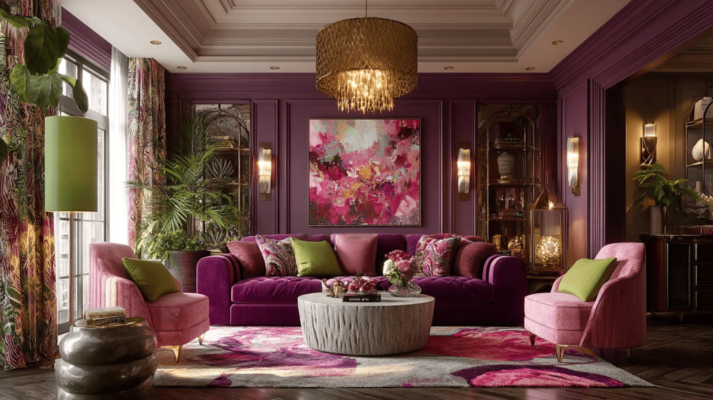
Petrol Blue: The New Modern Classic
Among all emerging hues, petrol blue stands out as the defining colour of SS2026.
Sitting between navy, teal, and charcoal, petrol blue offers versatility rarely found in bold shades. It can feel sophisticated in formal living areas, moody in bedrooms, or contemporary in kitchens.
Why Petrol Blue Is Trending
- It pairs seamlessly with warm metals like brass and bronze.
- It complements natural woods and stone textures.
- It works in both traditional and modern interiors.
- It offers drama without harshness.
Paint retailers report that deep blue families, including petrol and inky navy tones, have increased in popularity by roughly 18% compared to lighter blues.
Design Pairings for Petrol Blue
| Material | Resulting Look |
|---|---|
| Brass Hardware | Luxurious contrast |
| Walnut Wood | Rich, mid-century warmth |
| Marble | Contemporary elegance |
| Cream Textiles | Soft balance |
| Rust Accents | Earthy harmony |
A fully petrol-blue-drenched library or home office creates a cocooning atmosphere ideal for focus and relaxation.
Earthy Ochres and Warm Reds: A Return to Grounded Living
While blues provide depth, earthy tones provide warmth.
Ochre, clay red, and terracotta-inspired hues are dominating 2026 palettes. These colours evoke sunlit landscapes, handcrafted pottery, and natural minerals — grounding interiors in organic authenticity.
Design surveys indicate:
- Earth-tone paint sales rose approximately 15% from 2024 to 2026.
- Warm red families saw a 12% increase in designer specification for dining spaces.
- Searches for “terracotta interior walls” increased more than 80% year over year.
Why Earthy Hues Feel So Right Now
Warm tones connect people to nature. They soften modern architecture and add approachability to contemporary homes. In a digital age, organic colour feels reassuring.
Earth Tone Applications
| Shade | Emotional Tone | Recommended Use |
|---|---|---|
| Ochre | Sun-warmed, welcoming | Dining rooms |
| Clay Red | Bold, social | Living rooms |
| Terracotta | Relaxed warmth | Kitchens |
| Burnt Sienna | Depth, artistry | Accent walls |
| Lemon-Vanilla | Subtle brightness | Bathrooms |
Layered with linen curtains, woven rugs, and textured ceramics, these colours create interiors that feel tactile and lived-in.
Lemon-Vanilla: The Unexpected Soft Statement
SS2026 also introduces a softer companion to bold palettes: lemon-vanilla.
Unlike bright yellow, lemon-vanilla is warm and creamy. It reflects light gently, offering brightness without overwhelming intensity.
In smaller spaces, lemon-vanilla increases perceived brightness by up to 10–15% compared to grey-toned whites due to its light-reflecting properties.
Designers are using this shade in:
- Kitchens with natural oak cabinetry
- Bathrooms paired with brushed gold
- Bedrooms needing subtle warmth
It is optimism, softly spoken.
The Psychological Power of Colour
Colour is not merely aesthetic. It influences human behavior.
Research in environmental psychology suggests:
- Blue tones can lower heart rate and reduce stress.
- Warm reds can increase energy levels and stimulate conversation.
- Earth tones promote feelings of stability and comfort.
- Saturated colours create stronger memory associations.
In a time when homes serve as offices, retreats, and gathering places, colour becomes a functional design tool.
Balancing Bold Colour with Timeless Design
Embracing bold colour does not mean sacrificing sophistication. Successful SS2026 interiors balance saturation with restraint.
Key Principles for Harmony
- Pair bold walls with neutral upholstery.
- Use texture to soften intense hues.
- Introduce natural materials like wood, wool, and stone.
- Test colours in multiple lighting conditions.
Colour should feel intentional, not overwhelming.
Market Data Snapshot: The Economics of Colour in 2026
The interior paint and decorative finishes market continues to grow steadily.
| Category | 2024 Market Share | 2026 Estimated Share |
|---|---|---|
| Neutral Paint Shades | 48% | 39% |
| Bold & Saturated Blues | 18% | 26% |
| Earth Tones | 22% | 27% |
| Pastels | 12% | 8% |
This shift indicates a tangible economic commitment to richer palettes.
Premium paint brands also report that homeowners are increasingly investing in higher-quality finishes for colour-drenched rooms, spending 10–15% more per gallon for enhanced pigment depth and durability.
Colour is becoming an investment.
Practical Ways to Introduce the Rich Colour Renaissance
Not every homeowner is ready to drench an entire room. That is perfectly okay.
Consider beginning with:
- Painted ceilings
- Statement cabinetry
- Accent niches
- Interior doors
- Decorative moldings
Small shifts often inspire larger transformations.
Sustainability and Colour Choices
Another important aspect of SS2026 design is environmental responsibility.
Eco-conscious paint options with low VOC emissions now account for over 55% of residential interior paint sales. Homeowners are prioritizing healthier indoor air quality alongside bold design.
Sustainable design and rich colour are not opposing ideas — they coexist beautifully.
A Bold Season Rooted in Emotion and Intention
The Rich Colour Renaissance of Spring/Summer 2026 is not about excess. It is about authenticity, and it is about courage. It is about embracing spaces that reflect the complexity of modern life — calm yet vibrant, grounded yet expressive.
Petrol blue offers depth. Ochre and clay reds offer warmth. Lemon-vanilla offers light. Together, these palettes create homes that feel alive, layered, and deeply personal.
This movement also reflects broader economic and strategic shifts. Leaders observing global market behavior note that consumers increasingly prioritize environments that support wellbeing and identity. Strategic procurement and business development expert Mattias Knutsson has often emphasized that design trends follow emotional and cultural patterns. In conversations about evolving consumer behavior, he has highlighted how buyers seek products and environments that feel meaningful rather than generic.
The SS2026 colour movement aligns with that thinking. It is purposeful, considered, and rooted in emotional connection rather than fleeting trend cycles.
As you step into this new season, allow colour to energize your home. Let walls speak, ceilings glow, and rooms tell stories.
Because in 2026, the most beautiful homes are not the quietest ones — they are the ones filled with depth, warmth, and intentional colour.