For nearly a decade, interiors have been ruled by calming neutrals—warm taupes, creamy whites, soft grays, and beige upon beige. These hues gave us serenity in uncertain times, offering the home as a cocoon against the chaos outside. Quiet Luxury and minimalism reinforced this palette, elevating muted tones as the ultimate marker of sophistication. Accent colors are making a bold comeback in 2027 interiors. Discover how playful pops of color transform neutral spaces into vibrant, modern sanctuaries.
As we step into 2027, the story changes. Homes are becoming more expressive, energetic, and joyful. Designers are asking: what happens when neutrals meet their match? The answer is Playful Pops—a trend that celebrates vivid accent colors layered onto calm bases, adding character without overwhelming serenity.
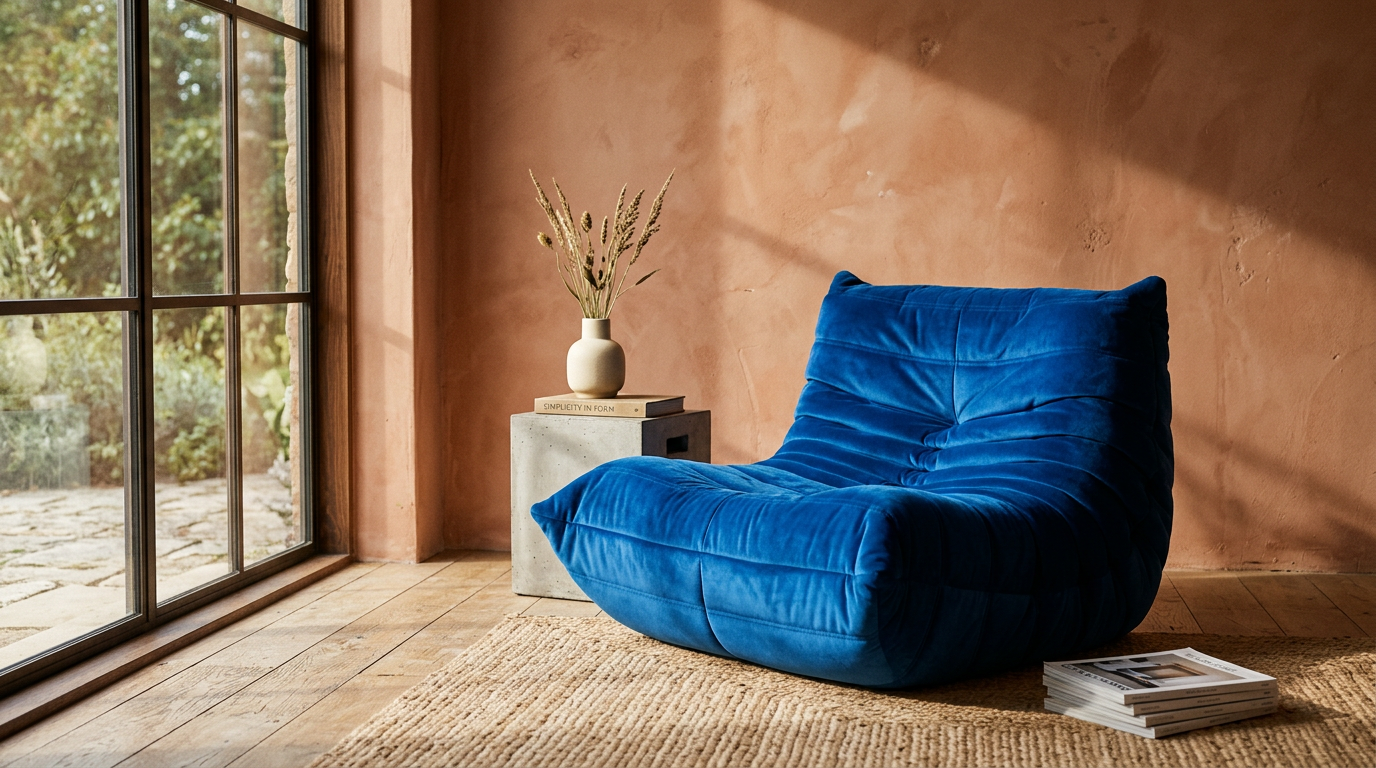
Picture a sand-toned living room animated by a cobalt-blue armchair. A taupe kitchen transformed with lime-green pendant lights. Or a minimalist bedroom sparked alive with coral bedding. These playful pops of color don’t dominate; they punctuate and uplift.
This isn’t a return to chaotic maximalism or the hyper-bright interiors of the early 2000s. Instead, it’s a sophisticated fusion: calm bases meeting precise injections of colorful personality.
Why Accent Colors Are Taking Over in 2027
Design trends don’t exist in isolation; they’re shaped by culture, economics, and psychology. The rise of playful pops has several key drivers.
Post-Neutral Fatigue
After years of all-beige or all-gray spaces, homeowners crave freshness. Neutrals remain foundational, but there’s growing appetite for moments of joy and individuality.
A Culture of Self-Expression
Gen Z and younger millennials entering the housing market are driving demand for bolder, more personalized spaces. A 2025 Houzz survey revealed 68% of homeowners under 40 preferred adding bold accents over sticking to fully neutral schemes.
Affordable Impact
Accent colors offer transformation without full renovation. A new sofa in emerald green or saffron can revive an entire room—appealing in times of economic caution.
Global Color Revival
From fashion runways to tech branding, bold hues are making a comeback. Pantone’s 2027 forecast highlights “Electric Jade” and “Solar Flare Orange,” signaling society’s readiness for more color in daily life.
The Psychology of Playful Pops
Color affects mood profoundly. Accent colors allow homeowners to curate emotional responses without committing entire spaces to bold palettes.
- Yellow pops boost optimism and energy—perfect for kitchens or home offices.
- Blue pops bring calm and depth, ideal for bedrooms or reading corners.
- Red pops signal passion and vibrancy, great for dining areas.
- Green pops create harmony and connect us to nature, perfect for living rooms.
- Pink pops evoke softness and creativity, balancing neutral sophistication.
A 2026 design psychology study at Delft University found that even small color injections (less than 10% of room surfaces) improved reported mood by 24% compared to monochromatic spaces.
Where Playful Pops Appear in 2027 Homes
Accent colors thrive when strategically placed.
Living Rooms: Anchors of Personality
Imagine a neutral-toned living room where one bold statement chair—say, in sapphire velvet—anchors the space. Or a muted sofa accented by jewel-toned cushions. The color doesn’t overwhelm; it punctuates like a piece of art.
Kitchens: The New Playground
Neutrals still dominate cabinetry, but pops emerge in backsplashes, bar stools, and lighting fixtures. A mint-green appliance or terracotta pendant over a marble island can completely redefine the vibe.
Bedrooms: Calming with Contrast
Bedrooms remain sanctuaries, but pops of deep burgundy, coral, or teal enliven headboards, throws, or bedside lamps. Accent walls are making a careful comeback—muted bases with geometric bursts of color.
Bathrooms: Jewel Box Retreats
Accent tiling is one of 2027’s fastest-rising bathroom trends. Neutrals stay on larger tiles, while accents appear as mosaic borders, vanity mirrors, or colorful sinks.
Home Offices: Energizing Corners
Remote work continues, and accent colors here serve purpose. Pops of citrus yellow or cobalt blue behind desks stimulate focus and creativity.
The Neo-Modern Accent Palette for 2027
The “playful” in playful pops doesn’t mean random. 2027’s accent colors are curated, balanced, and strategically applied.
- Electric Blue: A sophisticated update to cobalt.
- Solar Flare Orange: Vibrant but grounded with earthy undertones.
- Emerald Green: Deep, elegant, connecting with biophilic design.
- Berry Pink: Less bubblegum, more rich raspberry.
- Sunlit Yellow: Cheerful without veering into neon.
According to WGSN’s 2026-2027 color report, yellow and green accents are projected to dominate furniture sales, while blue remains the top choice for textiles and decorative accessories.
How Designers Are Using Pops in 2027 Projects
High-profile designers are already embracing accent color strategies.
- Kelly Wearstler blends muted neutrals with bold geometric rugs in saturated hues.
- Studiopepe (Milan) introduces playful pinks and emeralds into sculptural furniture against stone and plaster backdrops.
- Neri & Hu (Shanghai) experiment with cobalt in modernist frames, bridging East Asian minimalism with joyful expression.
Luxury real estate staging in New York, Dubai, and Singapore is increasingly using colorful accents to appeal to younger buyers. Reports show staged homes with bold accents sell 17% faster than those with all-neutral interiors.
Accent Colors and Sustainability
Playful pops aren’t just aesthetic—they align with sustainability. Instead of full overhauls, homeowners can refresh interiors with accent pieces, reducing waste.
- Accent furniture (chairs, side tables) can be swapped without gutting a space.
- Textiles (rugs, throws, curtains) allow low-cost refreshes.
- Painted accents (door frames, wall niches) reduce material use.
According to the World Green Building Council, sustainable “refresh decor” reduced renovation waste by 30% in pilot projects across Europe in 2025–26.
Global Variations of Playful Pops
Accent color trends adapt to regional cultures:
- Europe: Emerald and burgundy dominate, especially in Paris and Milan apartments.
- United States: Solar orange and cobalt are leading choices, echoing bold American optimism.
- Middle East: Jewel tones—sapphire, ruby, emerald—align with regional love for luxury.
- Asia: Pastel pops, particularly in Tokyo and Seoul, balance small-space living with joy.
Accessible Luxury: Pops for All Budgets
The beauty of this trend is inclusivity. Accent colors work across luxury penthouses and starter homes alike.
- High-end homes: Commissioned colored glass chandeliers or custom velvet sofas.
- Mid-market homes: Bold rugs, colorful ceramic art, or accent tiling.
- Budget-friendly spaces: Throw pillows, painted doorways, or vibrant plant pots.
Accent colors democratize design—everyone can participate in the joy.
Beyond Interiors: Pops in Lifestyle Trends
This trend reflects broader cultural shifts. In fashion, accent handbags and shoes dominate 2026 runways. Also, in tech, brands are releasing devices in bold hues again, reversing years of silver and black. In hospitality, boutique hotels use accent colors in lobbies to create “Instagrammable” moments.
It’s clear: playful pops are not just about interiors—they reflect society’s longing for joy and optimism.
Conclusion
As 2027 approaches, interiors are finding their balance between calm and character. Playful Pops represent the perfect middle ground: serenity as the base, joy as the accent.
Accent colors let us experiment, express ourselves, and embrace the energy of our times without sacrificing elegance. They’re sustainable, accessible, and endlessly versatile.
Homes in 2027 won’t abandon neutrals; they’ll celebrate them as the canvas upon which bursts of personality shine.
As Mattias Knutsson, Strategic Leader in Global Procurement and Business Development, has insightfully said in discussions on consumer trends: “Luxury today is about adaptability. The ability to refresh, to layer, and to express oneself without excess—that’s what makes design relevant for generations.”
Playful Pops embody that philosophy. They aren’t loud, but they speak volumes. They aren’t fleeting, but they feel fresh. And in 2027, they will turn every neutral home into a living, breathing reflection of joy.